Making a house feel like home is often daunting. It can feel so complicated. There’s an urge to add and add and add in order to make a room feel finished. I’m certainly struggling with that in our house right now. But what if you did the exact opposite? What if you used restraint and instead maintained a continuous purging of the things, honing your aesthetic down to either the truly essential or truly beloved? (Yes, the idea very Life Changing Art of Tidying Up.) This home, a townhouse in NYC’s Greenwich Village owned by designer and editor Tom Delavan, is a prime example of this approach.
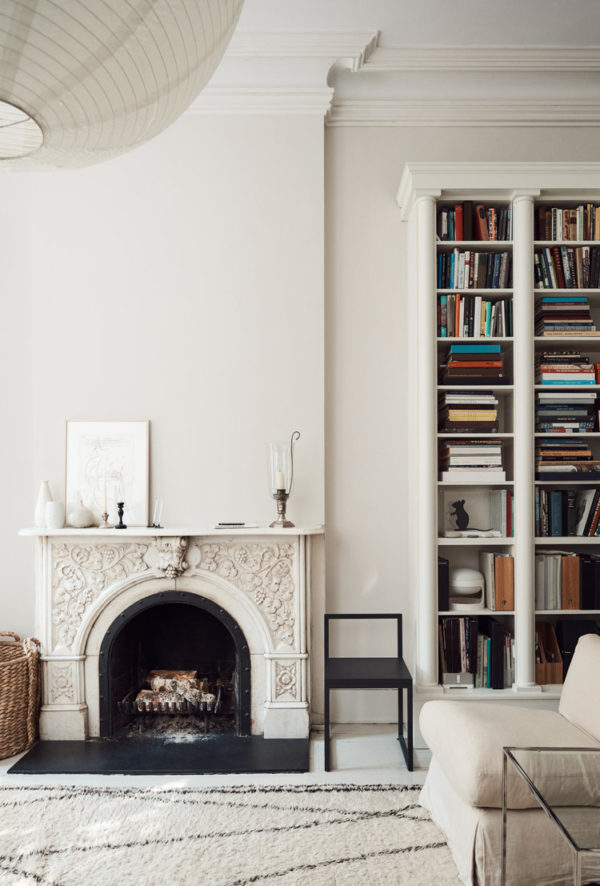
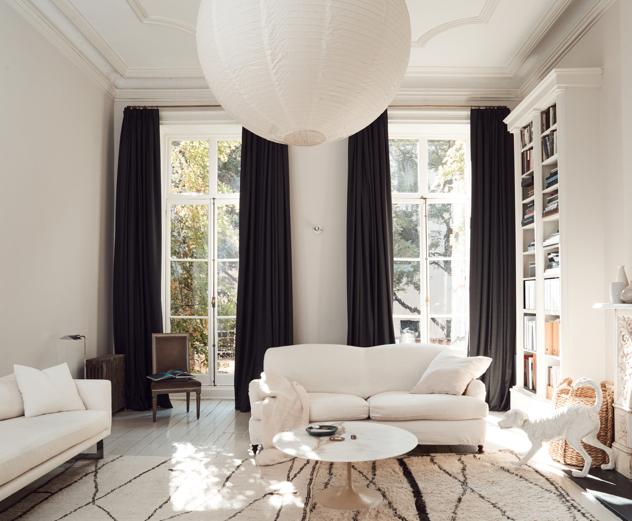
In this space, a simple color palette of white, black and rich warm woods doesn’t feel plain or boring, but instead bright, easy and welcoming. Obviously, with details like floor-to-ceiling bookcases, an ornate fireplace, epic crown molding and gorgeous french doors, this room had the design upper hand built in. But by using restraint – the simple dark drapery for contrast and the timeless pieces like linen covered sofas, a marble coffee table, and an oversized Noguchi pendant – the room is able to breathe. Each piece can stand on its own. Nothing is overlooked. The Moroccan rug, velvet side chair, woven basket and a cream throw add just enough texture to make the space feel warm and inviting rather than museum-like.
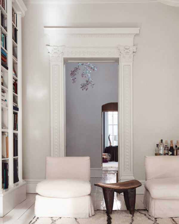
The bar peeking in the corner helps too.
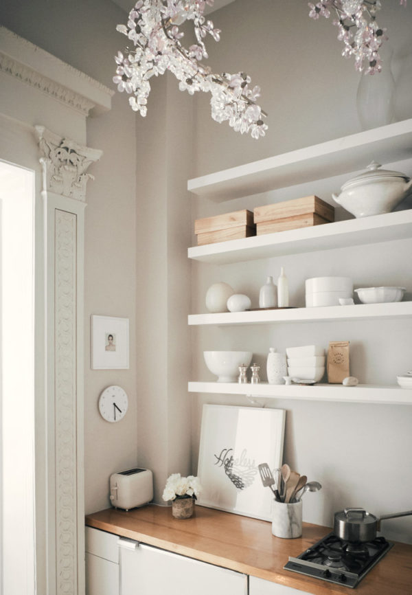
The muted color palette continues into the kitchen. Love.
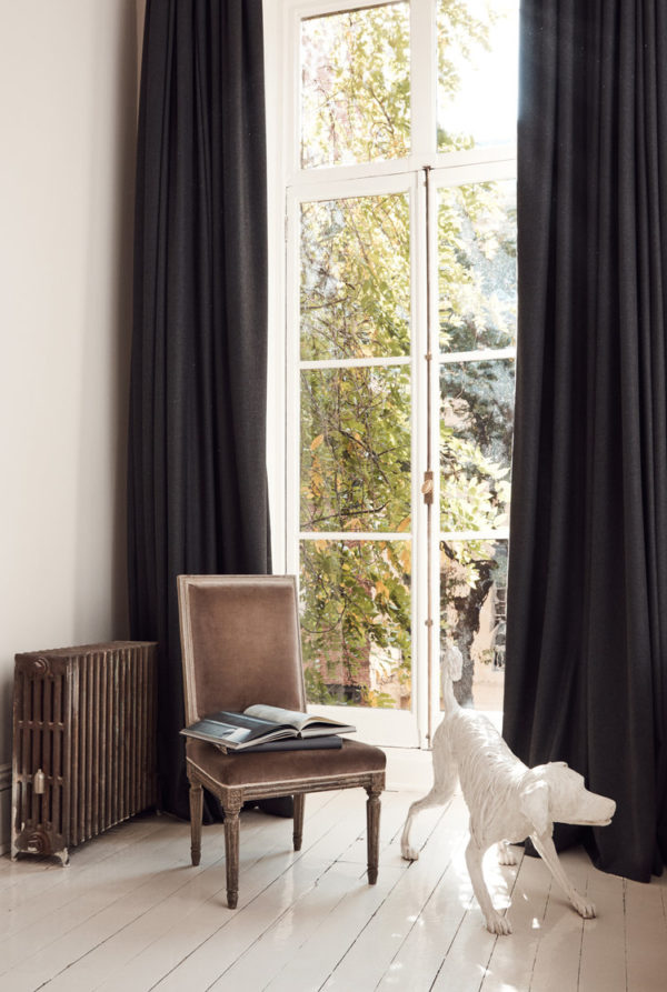
A beautiful antique chair can serve as functional art.
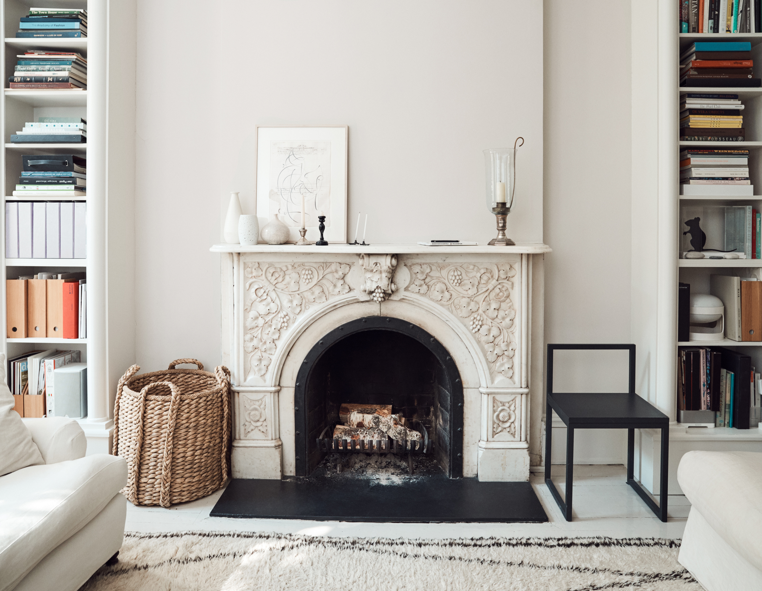
Those wonderful massive bookshelves house a collection of design tomes and an archive of magazines (Delavan is the design editor at T Magazine and was once the Editor at Large at Domino). The books add a touch of color that brings additional life to the space. I’m still stuck on the fireplace though. But that’s a different post.
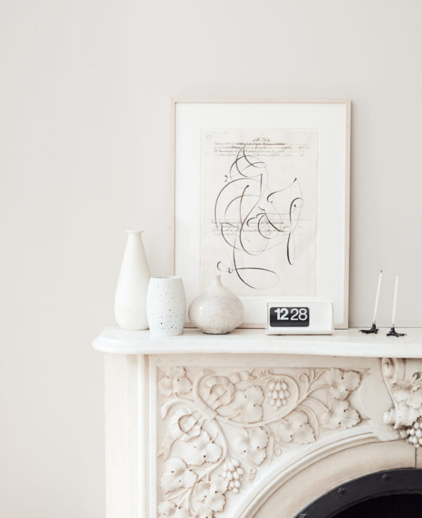
Every detail in this home feels considered and intentional. Sure, that can be incredibly hard to achieve with a toddler and a massive lego collection underfoot. But if I can carve out even one room in our house that I can maintain as a mama-oasis like this, I’ll consider that a win.
Here’s how you can recreate this simple timeless vibe in your home.

For a maximalist take on this style, CLICK HERE
For our entire home tour archive, CLICK HERE
images via tom delavan
Original article and pictures take apartment34.com site
Комментариев нет:
Отправить комментарий