We had 10 weeks to pull this project together, which is a ridiculously short amount of time in the design world. Not only did we have to rally to get everything planned and ordered, but we were literally installing the home at the same time as other construction crews were finishing up their projects! It was quite a process, but we loved how it turned out! For more behind-the-scene details check out our latest webisode. Check out the webisode and photo tour for part two while you're at it!
Thanks to Hallmark Floors for sponsoring the project! We used the Alta Vista Malibu throughout the first floor and it looks beautiful! If you're looking for flooring, I'd recommend looking at their site and finding a distributor in your area!

If you're not familiar with a Parade Home, it's a house participating in a tour of recently designed homes. We partnered with Flagship Homes on this project, which also doubles as the concept home for an entirely new neighborhood!!! We're excited about it, so feel free to ask any questions you have about the available homes in Vineyard, Utah.

The black window frames, natural wood detail, and light gray railing takes an all-white house to the next level. Recently, we launched our new line of front door mats!

Every home needs an indoor/outdoor rug like this Birmingham runner! Not only do we love the stripe pattern, but the rug is durable and can be washed off when it gets dirty.

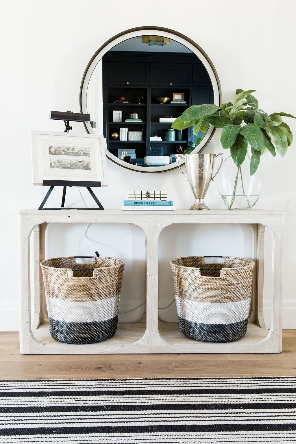
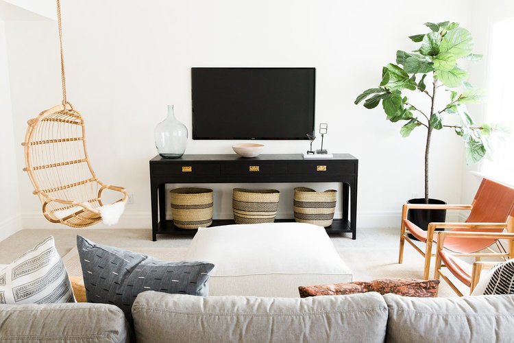
Styling the Hollie Console is easy and fun. Its open structure shows off the Striped Nesting Baskets that we use for quick and easy storage. They're the best place to hide your not-so-pretty household items like shoes or bags. We just got this unique Estelle Display Lamp in the shop and we couldn't love it more. The Davis Mirror and an Etched Trophy completes the look. We always keep a windowpane box handy for extra trinkets and car keys.


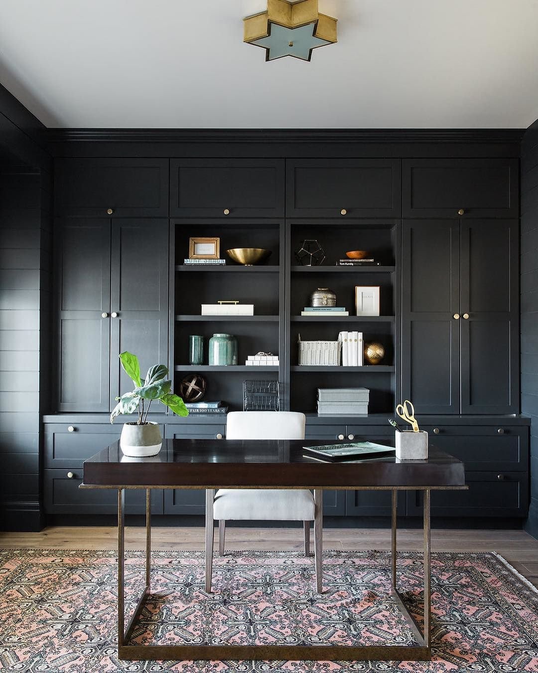
Benjamin Moore's Soot was the perfect paint color in this eclectic office. The rug is a vintage piece we snagged online, bringing in some character and charm. Speaking of character, the Sophia Flush Mount makes a sublte statement while remaining pretty versatile.


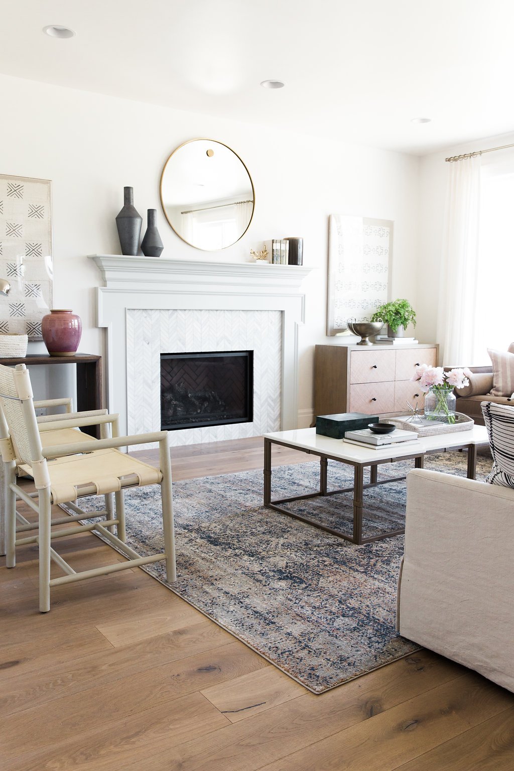
We used the Sonoma rug to bring classic, neutral colors into the space. By the way, it’s also really soft! We love the way it balances the somewhat industrial We used the rug to bring in all the classic neutral colors in the space. By the way, it's also really soft! It really softens the somewhat industrial Shia Coffee Table and Whitefield Dining Chairs.


We used a lot of soft tones in this living room, but still kept things interesting. The Mali Pattern 2 and Mali Pattern 5 frame the fireplace and Keller Mirror while adding a unique touch to the room. The Jennifer Long Sofa is a classic that can be used for years to come. We also added some dark tones with the Malcom Side Table, Dusk Artwork, and a console table.


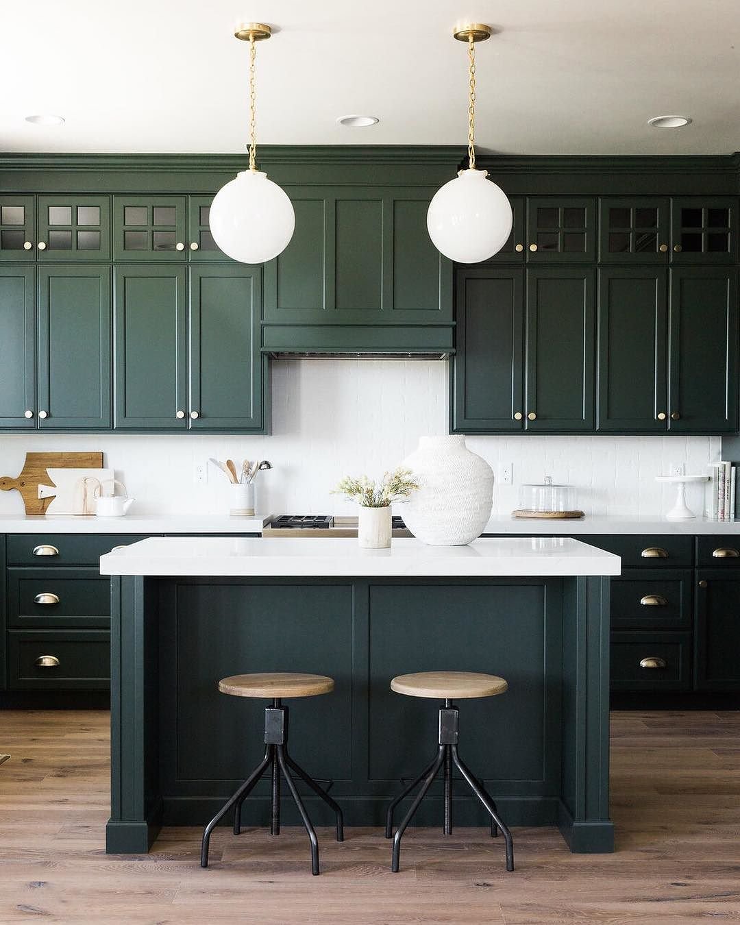
The Katie Globe Pendant almost always completes a room and this kitchen is no exception. We love how they pop against Edward Dunn's Black Spruce and create a bold, but bright space.



Original article and pictures take www.studio-mcgee.com site
Комментариев нет:
Отправить комментарий